Saturday, April 16, 2016

Film Critique


Deanna Miller

Humanities 101

Film Critique

Moonrise Kingdom

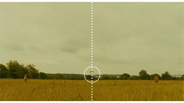
            Moonrise Kingdom a coming-of-age film directed by Wes Anderson and released in 2012. The film tells the story of two love-stuck teens and their journey to be together through all sorts of trial and tribulations while at summer camp. This film features the distinctive cinematic style of director Wes Anderson. I would like to discuss Wes Anderson’s film making style and in particular his use of symmetry and space within each frame. Wes Anderson breaks the rule of thirds that is commonly taught in art and instead chooses to use symmetry to define his shots. This makes his cinematic style very different from other directors.
            Moonrise Kingdom tells the love story of Sam Shakusky and Suzy Bishop, both young teens who find themselves in love with each other and run away to be with each other. This creates problems within the small New England island town in the summer of 1965. The small police force of the island, Suzy’s family and the Khaki Scouts all set out to search for the couple. While they are eventually found problems continue to ensue for the star-crossed lovers.
            The intent of this film is both for entertainment and to create an artistic statement. Wes Anderson made this movie with the intent to both make a profit and to display is particular cinematic style. Moonrise Kingdom raked in a total of $68 million in total sales (IMDb).
While this number is nothing to laugh at I believe this movie was more of an artistic statement by Anderson. He has made numerous movies over his career, all with his very unique style. Moonrise Kingdom is another testament to his stylization of film-making.
            The most striking thing about Wes Anderson’s film work is his use of symmetry within each frame. His film work seems to have been done with the utmost precision. Each frame seems to have been carefully planned. Wes Anderson seems to love to zoom into or zoom away from the subjects from a centered location. Panning shots are also quite popular in Anderson’s films. The camera will follow the subject while the subject is walking. The camera will stay focused on the subject while the subject interacts with others. This tracking is a main characteristic of his films.
The horizontal plane is also very important to the character of his films. The horizon in the background almost always forms a 90° with the subject. Right angles create a geometry that works well with the symmetry of his shots. His subjects are almost always centered within the frame and also framed by something like an arch or a window. (Wes Anderson Centered Comments Section) Wes Anderson’s meticulous attention to each frame makes it so that you could pause the film and each frame would be like a photograph. Wes Anderson had this to say about his style: “I have a way of filming things and staging them and designing sets. There were times when I thought I should change my approach, but in fact, this is what I like to do. It's sort of like my handwriting as a movie director. And somewhere along the way, I think I've made the decision: I'm going to write in my own handwriting. That's just sort of my way.” – Wes Anderson. The rule of thirds proposes that an image should be imagined as divided into nine equal parts by two equally spaced horizontal lines and two equally spaced vertical lines, and that important compositional elements should be placed along these lines or their intersections. (Rowse) This rule is most certainly broken in Anderson’s excessive use of symmetry.
Another unique characteristic is his use of colors in Moonrise Kingdom. The sky is perpetually blue and the grass always green. His color pallet is abnormally warm. Reds appear redder and yellows even brighter. You will see very few greys or blacks and whites. These color choices make the film Moonrise Kingdom appear old fashioned, like a 1970’s movie but with better resolution. In my opinion this also creates a storybook-like feel to Moonrise Kingdom. (Kogonada.com)
Something should also be said of the humor of Wes Anderson’s films. In Moonrise Kingdom the humor is very dry and sarcastic. This is another common characteristic among his films. There is always a sort of crazy, unbelievable scenario going on in his films and the main characters must overcome great obstacles. The jokes are often very subtle and you might not pick up on them right away.
In conclusion Moonrise Kingdom is a great example of the filmmaking style of Wes Anderson. He completely ignores the common rule of thirds found in art and instead creates centered shots with subjects that are framed within a shot. His use of space is unique in that Anderson is not afraid of leaving large spaces unoccupied. His creates a photo like quality to his frames and so his films are all the more stunning because of it. Moonrise Kingdom is a great movie for someone looking to study film. Anderson is a consistent director, you can spot a Wes Anderson film from a mile away after seeing just one.


Works Cited


IMDb. Moonrise Kingdom. 2012. 15 April 2016.

Kogonada.com. Wes Anderson Centered. 17 March 2014. Short Film.

Moonrise Kingdom. Dir. Wes Anderson. 2012. DVD.

Rowse, Darren. Rule of Thirds. 2015. 15 April 2016.

Wes Anderson Centered Comments Section. December 2015. Web Forum. 15 April 2016.


Saturday, March 26, 2016

Painting Critique Narrative Painting

Deanna Miller
April 3 2016
Painting Critique
HUM 101

                                                            Perseus and Andromeda

         Narrative paintings tell a story, but a story without words. Narrative paintings set themselves apart from other forms of paintings for their complexity. The idea of telling a story with nothing more than brushstrokes is most certainly something to be impressed by. I was very impressed by Joachim Anthoniszoon Wtewael 1611 paining Perseus and Andromeda.

         This painting depicts the mythological story of Perseus and Andromeda. Andromeda’s mother boasted that her daughter was more beautiful than any of Poseidon’s nymphs. In return Poseidon unleased a powerful sea monster upon Andromeda’s kingdom. To save the kingdom Andromeda’s father decided to sacrifice his daughter to the monster. The painting features the climax of the story where Perseus, on the back of Pegasus, comes to rescue Andromeda from the monster. It should be mentioned that artist Cavaliere d’Arpino painting this story earlier, in 1594, but I have chosen to discuss Wtewael’s piece because I feel that it is a more interesting piece.

        There is much to be discussed about the elements of design in this painting. The medium used in this piece is oil on canvas and this creates very soft lines. Detail however is not lost in any way in this piece. The texture is also very soft because of the medium used in this painting. The shapes and forms are very organic. The female nude being the best example of this. I believe her form seems to be idealized and is not entirely realistic. The color choices in this piece are very interesting. Overall the colors are much muted. It seems that Wtewael has chosen a more pastel pallet. The color pink can be seen quite a bit within the painting, as well as greys, blues, and greens. These color choices may play a big part in the overall feel of the painting Wtewael was trying to achieve. Additionally the value of the colors in this piece help create the depth needed in such a powerful narrative painting. Shadows are created on Andromeda suggesting that a light source is being cast on her from her right side. To me this seems strange because the sun can be seen through the clouds behind her. Perhaps this false light source was used to create emphasis on the subject. The use of space is also interesting in this painting. The female form takes up one side of the painting in the foreground and the battle between Perseus and the monster take up the other side of the painting in the middle ground.

        To discuss the principles of design one must first start with contrast. There is a good example of contrast within this painting when looking at the foreground and background. In the foreground of the painting exists the warm toned female form, and in the middle ground there is Perseus and the monster. These figures are all warmer tones like pinks and greens. In the background however there is contrasting secondary colors like darker blues and greys. As mentioned above the false light source creates emphasis and focus on Andromeda and the actual light source puts emphasis on Perseus and the monster. Repetition can be seen in the shells at Andromeda’s feet and movement can be seen in Pegasus and the monster.   
          
        When analyzing and interpreting the painting I feel the elements and principles of design work very well together to create an interesting piece of art. The eye is drawn to the proper places and emotion and movement are created within the piece. The motivation for creating this piece seems to be to convey some sort of moral. According to NGA.gov Dutch painters of the 1600’s wanted to create a sort of moral dilemma for the viewer and Wtewael’s most certainly achieved this.

     When judging the painting the very prominent female form in the foreground makes me think the main theme would be feminist but I suppose power could also be a secondary theme of this painting. The overall feel of the painting is soft and the use of oil paints help in this feel. The nude female form is also very soft so a feminist theme can be seen. The pink shells at Andromeda’s feet can be seen as suggestive, if you choose to look at them that way.  Andromeda is seen as vulnerable and in distress, not able to take of herself. Lastly the color choices of pinks and muted pastels help create a more feminine feel. The sea monster in the background is a very formidable enemy and the theme of a hero defeating a vicious creature is very much power related. The story behind the painting is more power related as well. I do believe the artist was successful with this painting. The story is accurately portrayed and the painting is very appealing to the eye.

     In conclusion narrative painting are interesting for a number of reasons. They explain a story without using words and require that a masterful artist use all his skills. Narrative paintings like Andromeda and Perseus require much more in depth analysis than your average painting.


                                                                     Work Cited

Photo From: WikiArt. Perseus Rescuing Andromeda. n.d. 26 March 2016.

National Gallery of Art. Pleasure and Piety: The Art of Joachim Wtewael. 4 October 2015. 26 March 2016.


Monday, February 22, 2016

Non Western Art Critique

Deanna Miller

Humanities 101

Feb 28, 2016

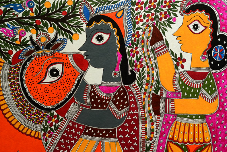
          Madhubani art is a traditional style of Hindu painting that originated in the Mithila region of Nepal. The paintings are distinctive and a prized part of the Mithila culture. The distinctive style is passed on through the women of a family, from mother to daughter, and so the tradition lives on even today. Madhubani painting is a traditional folk art with themes that have changed through the generations. Originally painted on the mud walls of a family’s hut for decorative purposes, Madhubani paintings have gained in popularity and are now sold commercially for profit (Color of India). Older Madhubani paintings displayed themes of a symbolic nature that represented fertility, rejuvenation, or prosperity. These paintings originally served as a preparation of marriage and so themes like fertility were appropriate. Other traditional themes include depictions of Gods and Goddesses. The eyes of the subject are oversized and almost always shown in side profile. The themes of today reflect current issues facing women and are considered more socially charged than before. Painting is seen as a women’s tradition and women of the region have taken advantage of that fact and have begun using their paintings to bring about awareness of women’s rights in the themes of modern Madhubani paintings (Madhubani Painting). Madhubani paintings serve as an important cultural aspect of the region and will remain so for generations to come.
          Madhubani painting is distinctive from other Hindu painting styles in many ways. Although it is not known when Madhubani paintings originated, The Madhubani region has had its own distinct regional identity for up to 2500 years. Madhubani paintings are created on mud walls, canvas, or cloth. To apply the natural dyes and pigments women of the region use a multitude of tools such as twigs, matchsticks and fingers (Indian Folk Art…). 
          Color is an important aspect of Madhubani paintings as almost all Madhubani paintings are colorful if not overly so. Realist color choices are not used in Madhubani as people are often shown in deep shades of blue or yellow. Modern Madhubani paintings however usually depict people in neutral flesh tone shades. Animals are also a popular subject of these paintings and are also shown in side profile with overly large eyes and also in unusually colors. Colors are also very highly contrasting. A color on one side of the spectrum may be used adjacent from a color on the other side. For example blue next to yellow or red next to green. This contrast creates a pop in the paintings that is very eye-catching. 
          Another distinctive aspect of Madhubani paintings is the use of repetition and the use of space. Shapes are repeated over and over till fill almost all available space. Small flower shapes, circles, squares, and lines are very repetitious. There is almost always a decorative, repetitive border on Madhubani paintings that further fills empty space. Although the repetition makes if difficult to distinguish between the background, middle ground, and foreground, one could see the main figures as the foreground and middle ground and the repetitious shapes and flowers as the background.
          There are some other things to be mentioned about the seven elements of art that make Madhubani paintings unique. The seven elements of art include line, shape, color, value, form, texture and space. As mentioned above color and space are the main factors that make Madhubani paintings unique. The value of the colors is very uniform and there seems to be no effort to create the illusion of light in these paintings. There are no tints or shades. The texture of the older Madhubani paintings would be more emphasized because of the application of color using fingers or more basic tools. Today these paintings are mass produced prints with no texture. The application of lines are thick and sometimes harsh. The form of these paintings is very two-dimensional and has very little depth because of the lack of value in the colors. Objects are both organic and geometric with the central figures being more organic and the repetitious background being more geometric.
          The principles of design should also be mentioned when analyzing Madhubani paintings. These seven principles include unity, rhythm, emphasis, pattern, movement, contrast and balance. As mentioned above contrast, pattern and rhythm are important principles of Madhubani paintings. Most paintings feature some kind of symmetrical balance with the use of small repeating shapes in the background. There is some movement in these paintings but with the lack of value it is not very noticeable. There is emphasis on the main subject of the paintings because the repeating background is easily overlooked and draws the eye to the subject rather than the background. Unity is also seen in these paintings as even though there is a lot of details in these paintings they are all of the similar design and so they work together well. 
           Madhubani paintings are an interesting part of this local culture and will continue to be popular for generations to come. These paintings preserve a local culture and help spread this rich culture to all around the world. 


Works Cited

"Color Of India - Madhubani Art." Color Of India - Madhubani Art. Web. 21 Feb. 2016.

"Madhubani Painting." - India, Madhubani Art, S Bihar. India Tours. Web. 21 Feb. 2016.

"Indian Folk Art of Madhubani Painting." HubPages. HubPages. Web. 21 Feb. 2016.


Wednesday, February 3, 2016

Deanna Miller
Humanities 101 CRN 31983
February 6, 2016
Architecture Critique Blog Post

            Most consider the ancient Greek architecture found in exotic European cities and countries like Rome, Greece and Athens to be some of the most beautiful the world. Those people would be correct. The Ancient Greeks contributed much to many areas of life like religion, art and philosophy but today we will discuss their contributions to architecture. But not architecture on the other side of the world. If you take a look around you might just find a little bit of ancient Greece in your back yard.
In Dauphin County Pennsylvania you will find Chocolate Town USA- Hershey PA. One might not think of Greece when thinking about Eastern Pennsylvania but you will find a little bit of the Ancient Greek way of life on the corner of Chocolate Avenue.
The Hershey Trust Building at One Chocolate Avenue was built in 1905 and has stood firmly since. It may have changed hands many times over the years but its purpose and architecture have not. Milton Hershey ordered the construction on the building to fit the growing financial needs to the city. The credit for its growth goes mostly to Milton Hershey himself. You do not get a town named after you for nothing after all. Originally the Hershey Trust Company in 1905 and opened on June 15th, the building later became the Hershey National Bank 20 years later in 1925. After that the Hershey National Bank was acquired by PNC Bank. According to the Hershey Archives website the front of the building as well as the majority of the interior was rehabilitated in 2006 following its acquisition by Bryn Mawr Trust Company. Today the building is owned by Bryn Mawr and is still used as a financial institution for the city of Hershey PA. (Hershey Community Archives)
The building is flanked by two large columns with the distinctive volutes on the capital of the column meaning this building is of the Ionic order. The columns of the Ionic order are thinner than the other orders but you might not realize it while gaping at them (Muscato). There are other columns around the back end of the building as well. These smaller columns are used to support the roof over the drive-thru at the back. This was a bank for many years after all. These columns are also of the Ionic order. The majority of the building is made of brick. In addition there is a small arch over top of the door with an inset sculptural design underneath it. This is also indicative of the Greeks as the arch first appeared in Mesopotamian architecture. (History of Architecture) The building itself is not very ornamental or decorative. The builders were most likely not interested in decorative pieces. The Hershey Trust Building features a portico or porch, albeit a small one. The building also features a large pediment although it is rather plain and also not decorative.
Of the three Orders of Greek architecture, Ionic seems to be the most appropriate. The two large columns command respect. Fancy art work and decorative pieces were not what the designers of this building were going for. Corinthian and Doric Order would not have been fitting for this building. The Hershey Bank was built for one purpose and one purpose only- to provide a reliable and stable financial institution for the entire city of Hershey. The bank being the "money god" of the modern era. The Ionic Order is most fitting for this type of building. The building has since changed hands over the years but all the owners of this building are in the finance industry and the finance industry is in the business to make money. Money is a very serious issue so avoiding decorative capitals on the tops of the columns. The use of volutes on the Hershey Trust Building creates an atmosphere of trust and properness, strength and stability; just what is needed for a financial institution. The Ionic order is the usual order when building post-Renaissance libraries and courts of justice which should be viewed as “learned and civilized.” Vitruvius (c. 70-15 BC) wrote that Ionic design is "an appropriate combination of the severity of the Doric and the delicacy of the Corinthian." (What is…) Vitruvius is most correct in my opinion.
In conclusion the Hershey Trust Building is one of refined architecture. The Ionic Order suits it well even after all these years. There is no doubt in my mind that the builders of the Hershey Trust Building were looking to impress the public with its architecture, to prove that the building will still be standing over 100 years later. As Julia Morgan says “Architecture is a visual art and the building speak for themselves.”


Works Cited
"Hershey Community Archives | Hershey Trust Company." Hershey Community Archives |
Hershey Trust Company. Web. 02 Feb. 2016.

Hershey Trust Building photo-Google Maps

"HISTORY OF ARCHITECTURE." HISTORY OF ARCHITECTURE. History World. Web. 02                   Feb. 2016.

Muscato, Chris. "Ionic Order of Greek Architecture: Definition & Example Buildings - Video &    
Lesson Transcript | Study.com." Study.com. Web. 02 Feb. 2016.

"What Is an Ionic Column?" About.com Home. Web. 02 Feb. 2016.